For this latest assignment,
we have revisited the few Principles of Design that are
essential for us (designers-in-training) to apply and adhere
to whenever we create/design something. From my knowledge, there are plenty of
design principles that are important. For example, Balance, Unity, Dominance,
Variety, Repetition, Static & Dynamic and that’s exactly what I have
experimented for this assignment. So, let me take you down my memory lane to help you understand better the certain Principles of Design. =) PS: This assignment was done based upon 'KIRIGAMI/Paper Cutting" Technique & only made out using Squares.
For this latest assignment,
we have revisited the few Principles of Design that are
essential for us (designers-in-training) to apply and adhere
to whenever we create/design something. From my knowledge, there are plenty of
design principles that are important. For example, Balance, Unity, Dominance,
Variety, Repetition, Static & Dynamic and that’s exactly what I have
experimented for this assignment. So, let me take you down my memory lane to help you understand better the certain Principles of Design. =) PS: This assignment was done based upon 'KIRIGAMI/Paper Cutting" Technique & only made out using Squares.

First off, let's start with what I understand about BALANCE

Take a look at this cube block and imagine there are two of the same kind.

Now, balance works like this. If you take this 2 cubes and place them side by side, you can tell that they are identical in weight, size & sometimes color value. That's part of what it means to be balanced, because they have 'EQUAL' qualities on either side. Even if you were to put these 2 cubes far apart from each other, it's STILL balanced because like I've mentioned, they are EQUALS in characteristics. Some would call 'balance' a concept of visual equilibrium. For this principle, there are 2 kinds of balance, that is SYMMETRICAL & ASYMMETRICAL. Here's an example of what a symmetrical 2-D design looks like...


Symmetrical Balance is a mirror-image, where if you draw a line down the page, you can see that half the page's objects are mirrored onto the other half. Did you know that our faces are symmetrical as well? Don't believe it? Then take a look at your own reflection. Even butterflies are symmetrical.
So, here's my version of SYMMETRICAL BALANCE.

Next, let's take a look at ASYMMETRICAL BALANCE.

Although it looks simple, asymmetrical balance is harder to create compared to symmetrical balance, because one has to carefully plan and weigh the layout. It's also known as 'Informal Balance'. It's when the objects of half a page is heavier than the other, whether in terms of weight, value or size. Or it's just DISTORTED compared to the original look. Here are 2 examples :
 |
| Realize how one side of the picture is heavier? |

And now, here's my understanding of Asymmetrical Balance.

Moving On, let's get on to know Unity & Variety.
 |
| From : http://kcfac.kilgore.edu/aafh/ch3.html What can I say about Unity & Variety? Well, to separately define these 2 principles, Unity is the result of a composition that has achieved all the principles of design such as balance, emphasis, dominance, scale etc. Unity makes your composition complete and nice to look at. On the other hand, Variety gives a sense of non-boredom to the viewer and it's a complement to Unity. Variety can be achieved by using different shapes, color, lines, texture etc. Once Unity & Variety are combined, it can produce an interesting outcome. Here are a few examples : |
 |
| From : http://maggiefieldsdesign.blogspot.com/2011/03/unity-with-variety-23.html |
 |
| From : http://drawfoundations.blogspot.com/2006/09/blog-assignment-2-unity-and-variety.html |
Now, here's mine.

Now, let's move on to the next principle : Rhythm & Repetition.
 |
| From : http://carmenkingston-digi2010s2.blogspot.com/2010/07/rhythm-repetition.html Rhythm & Repetition, these words we often hear but, do we even understand how powerful the repeated patterns are? To me, each repeated pattern defines a certain meaning. Rhythm & Repetition creates a sense of illusion and of course movement. Different way of arranging these shapes can create different patterns, movements and evokes various emotions from the viewer. Curvy edges provide an organic movement whilst sharp edges creates an inorganic movement. Here are some examples as usual : |
 |
| From : http://ifyoufindtheearthboring.com/2012/04/03/rhythm-repetition-are-the-root-of-movement/ |
 |
| From : https://lagcc-cuny.digication.com/renata_ralbovskys_fine_arts_eportfolio/HUA_104/published/?sh_5850513=6&moduleinstid=5850513&page_mode=published Now, Here Are my Versions : 
For this one, I created it to look like some kind of explosion, which portrays the movement going in all directions. These repeated lines were cut out from 3 squares of 10x10cm.

This one was created based upon a basic rhythmic movement, like the blades of an operating fan. Although I have two kinds of line patterns, but repeatedly they form a certain flow.
The Next Principle involves...Scale & Proportion.
 Scale & Proportion are important principles in design. If a composition has no scale & proportion, then it is useless & meaningless. An object with a larger scale gives visual weight more than a smaller object. Distance plays a big role in scale & proportion because if you have 2 cube blocks and you place one horizontally further away from one another, the cube closest to your eye level is bigger compared to the one in the background. Here are examples that implements this principle:  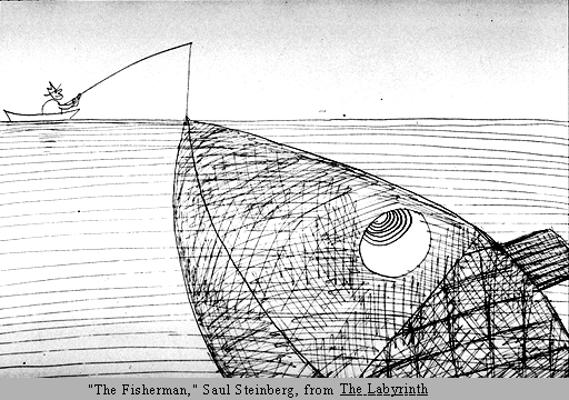
And this is from me :
 
The first thing that will catch the viewer's eyes is the BIG MAN IN THE RED SUIT, compared to the other red man and words. The Color RED is the dominant subject, followed by the man himself.

Can you guess which is the DOMINANT one?
And This Is My Version :

I had this done by comparing the various sizes, so the biggest Square is the Dominant one. Also, if you compare the patterns I used, then the Big Square solely has its own pattern than the other maze-like patterns, to portray its dominance in the composition.
Another few Principles are STATIC & DYNAMIC. The word static can be replaced by the word 'rigid' or stationary. When the viewer's eyes come upon a static composition, it's usually arranged in a straightforward style, in either horizontal or vertical manner only. It can be boring if compared to Dynamic Principle because it has no sense of movement. On the other hand, it makes a person feel calm and at peace. In comparison, Dynamic movement can be replaced by the word 'Energetic'. A Dynamic composition is often portrayed in diagonal manners, the complete opposite of being in a straight line (horizontal or vertical). It is more interesting and it can create a sense of movement & tension. Compare them and you'll see their weaknesses but, if you combine them, these 2 principles are indestructible and powerful is you know how to manipulate them.
Examples :

STATIC MOVEMENT
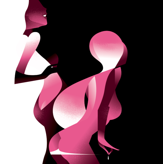
DYNAMIC MOVEMENT
FROM : http://ego-alterego.com/2011/11/dynamic-art-deco-style-illustration-by-mads-berg/#.UHklRW_MiME
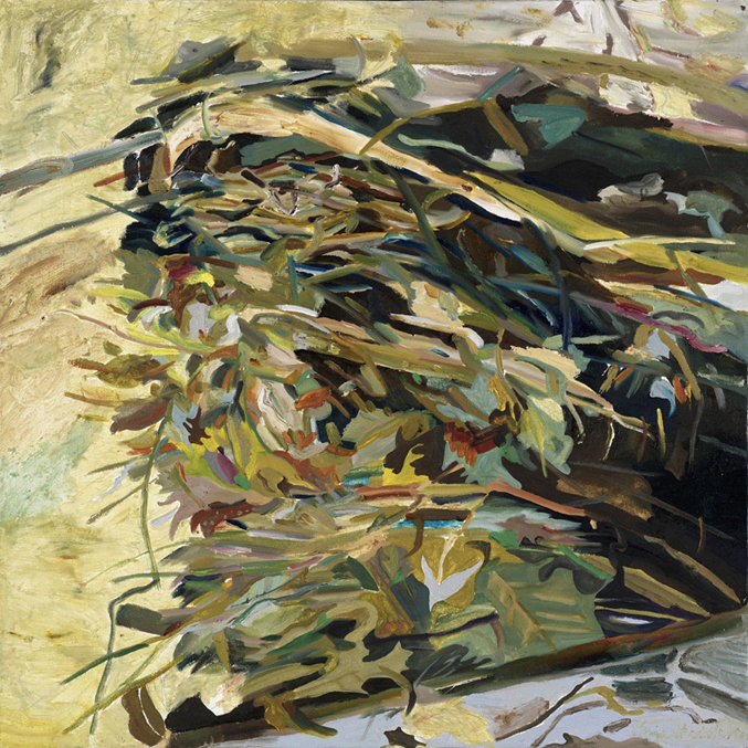
STATIC & DYNAMIC MOVEMENT
And These Are My Individual Versions :
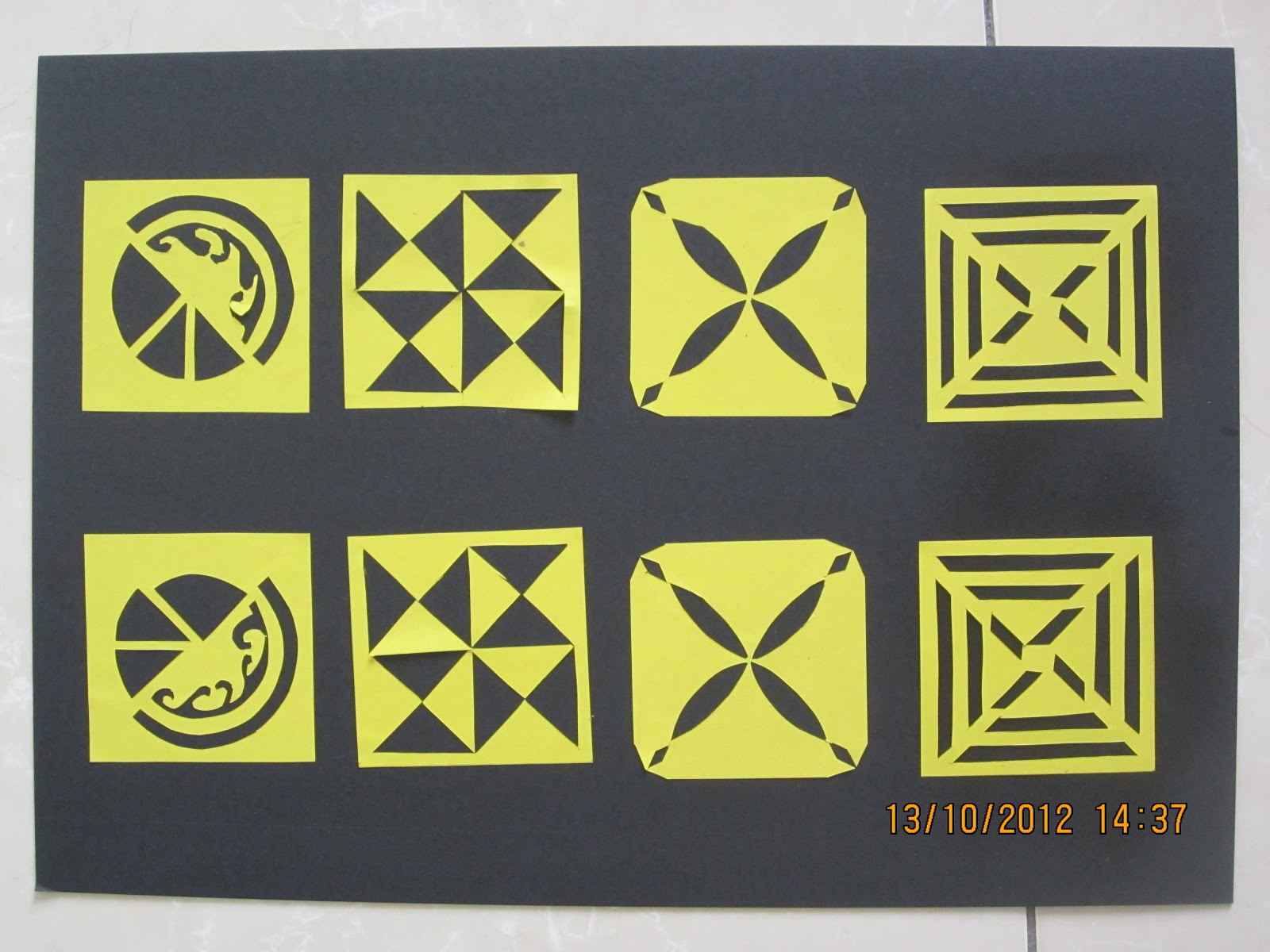
STATIC MOVEMENT

DYNAMIC MOVEMENT
For this paper-cutting Dynamic composition, I had it tested on my grandmother who has no idea whatsoever about principles of design. So, I asked her if she could see any sense of movement for the above picture and she said "Yes, I see it moving (she points out with her finger, following the flow of the patterns)." Also, i realized that if one doesn't understand Static & Dynamic Principles, then it can be tricky to manipulate them because you can't make us of something you barely understand.
Right now, I'm currently still undergoing training to familiarize myself with these principles. To me these principles have a wide range of usage if it is understood well. I'm uncertain if the versions I have fully portray my understanding but, I have gone for the more basic display of understanding these principles before I involve myself deeper into its meanings. For example, utilizing all the design principles in my composition. No doubt, it would be a wonderful masterpiece but I'm still trying to take them in like how I breathe air. So, thanks for reading this post! =D Hope I haven't disappointed you.
|